Branding Your Program
Personalize your online member experiences with the power of Spendgo, while keeping your brand at the forefront.
Things To Know
Changes to your branding may take up to 4 hours to show.
For more customizations, we recommend using our Member APIs. Contact your Customer Success Manager for more details.
How-to Update your Branding
Go to Settings / Branding.
Upload your images and enter your program details in each section—Logos, Sign-In Site, Sign-Up Site, and Member Portal—that you want to display in your Member's online experience powered by Spendgo. See your Branding Configuration Options below.
Click Save in each section before clicking into the next.
View your changes in your live site.
Note: changes may take up to 4 hours to show.
Branding Configuration Options
Configuration | Details | Example |
|---|---|---|
Logo Image | Your logo image must be a PNG file and will appear at the top of your Sign In and Sign Up forms. | 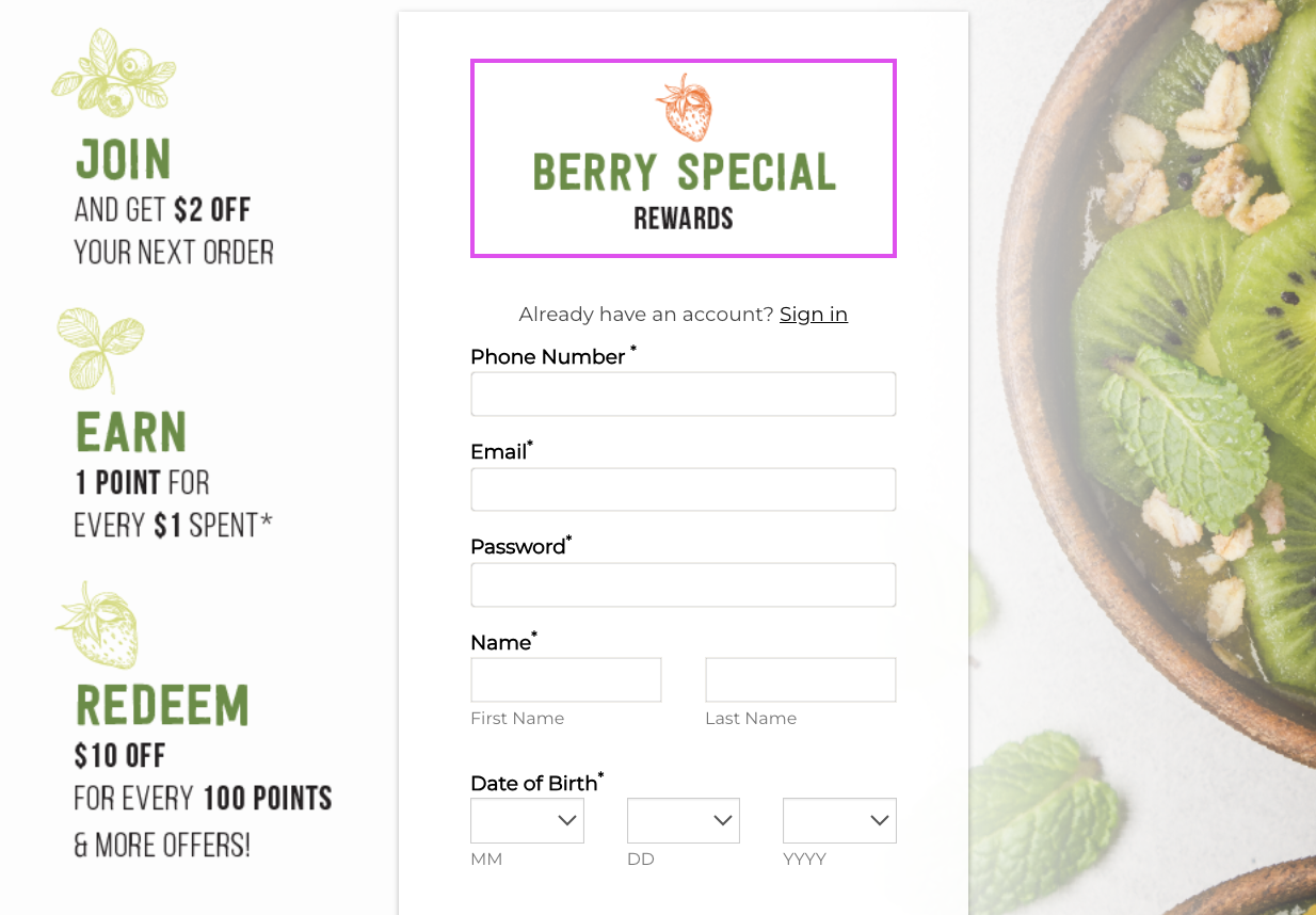 |
Square Logo Image | Your square logo image must be a JPG file and will appear in Spendgo generated email notifications — such as, the Create Account Verification, Spendgo Welcome and Password Reset. | 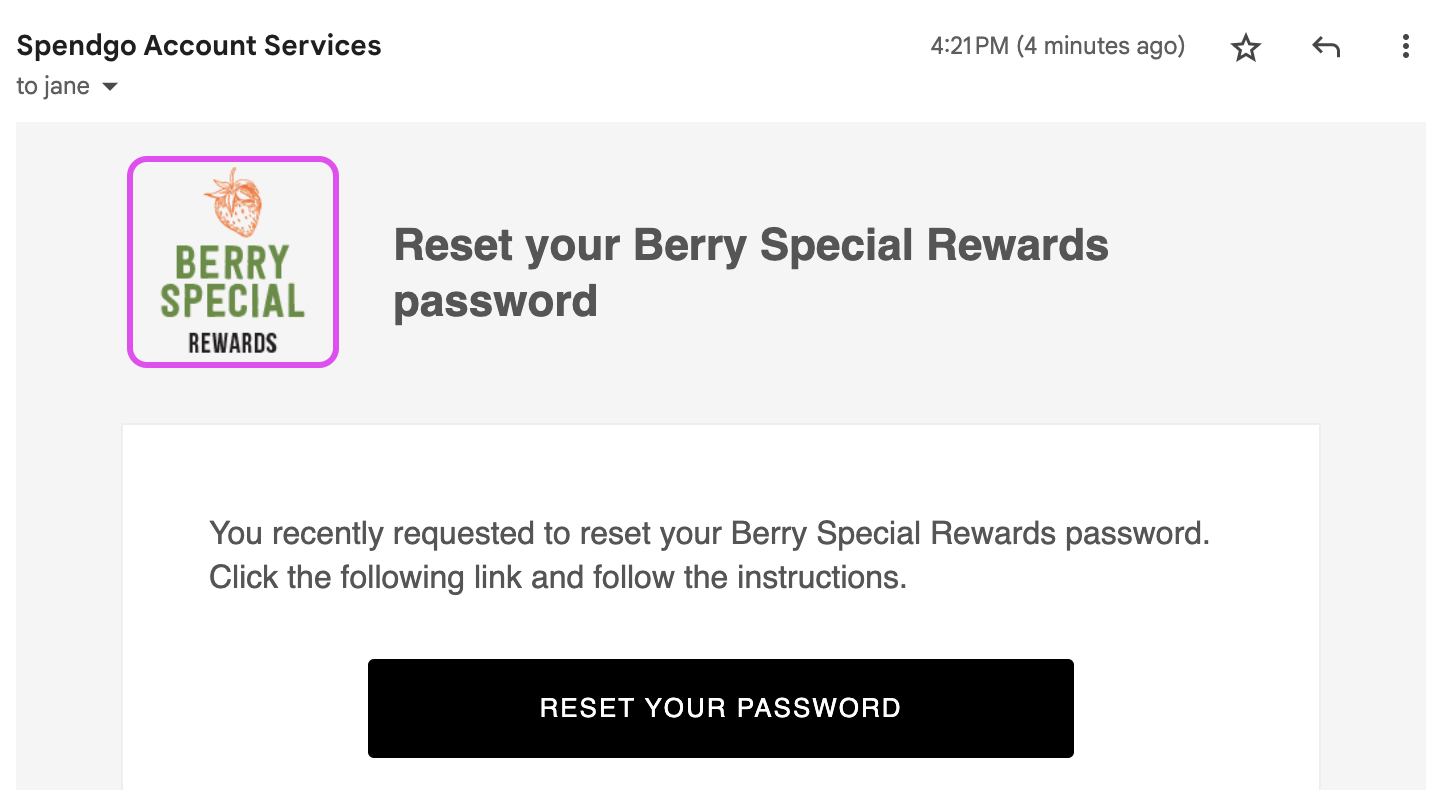 |
Background Image | Your background image must be a PNG file and will appear in your Spendgo Sign In and Sign Up Sites. You may upload a different background image to each section.Use the Background Image Template to avoid any cropping. | 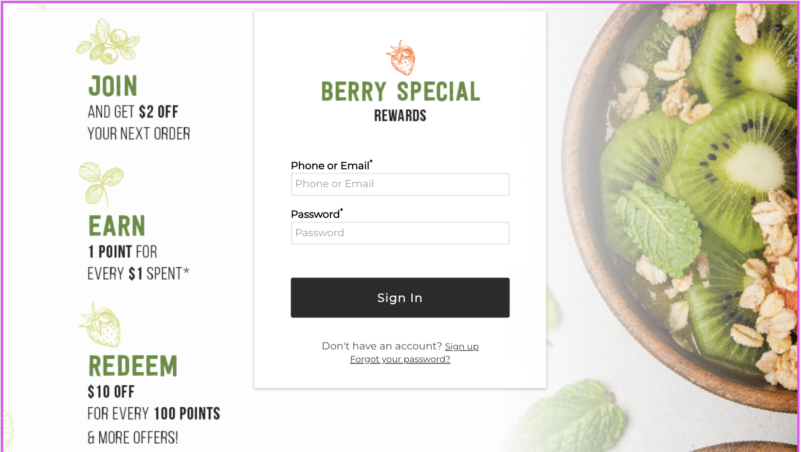 |
Header Text | The Header Text is optional text that can be shown at the top of your Sign In and Sign Up Sites. Different Header Text can be configured in each section. This is commonly used to provide more context to your customers before signin in or up. | 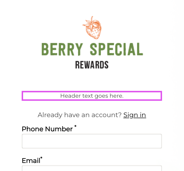 |
Footer Text | The Footer Text is optional text that can be shown at the bottom of your Sign Up Site. This is commonly used to provide more privacy and term detail or links to your customers in the sign up process. | 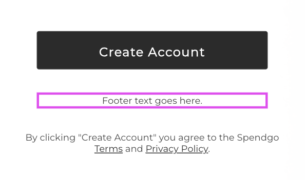 |
Email Opt-In | With the Email Opt-In Configuration, you have the option to display or conceal the email opt-in checkbox in your sign-up form. Additionally, you can input custom terms and conditions to be presented as the agreement for subscribing to your program emails. When enabled, the checkbox is default checked in the form, for further customization please contact your Customer Success Manager. | 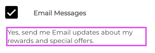 |
Text Opt-In | With the Text Opt-In Configuration, you have the option to display or conceal the text opt-in checkbox in your sign-up form. Additionally, you can input custom terms and conditions to be presented as the agreement for subscribing to your program's text messages. When enabled, the checkbox is always default unchecked in the form. | 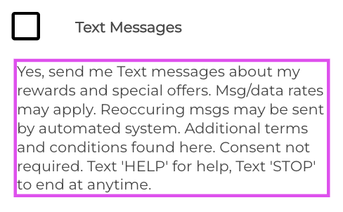 |
Banner Image | Your banner image must be a PNG file and will appear to members who are logged in to your Member's Portal. | 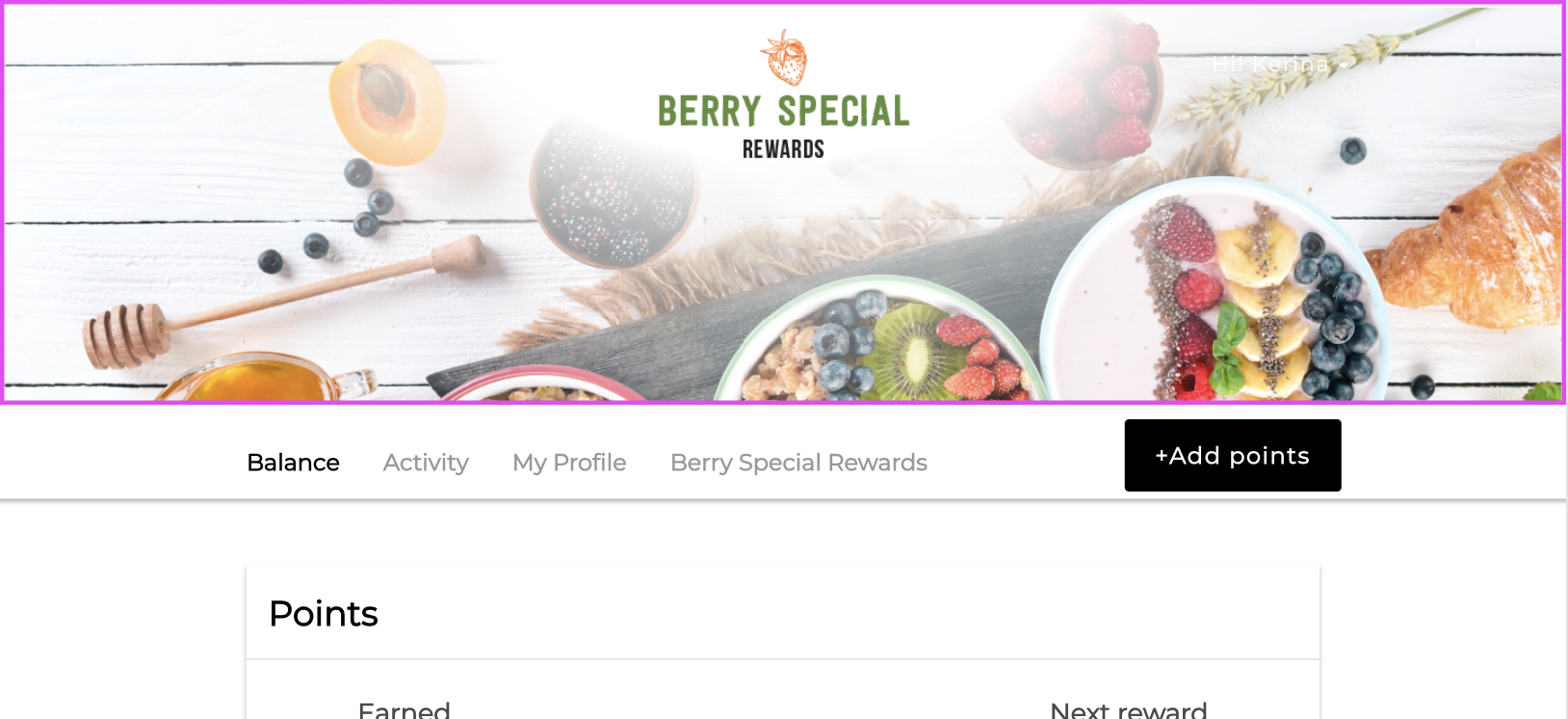 |
About | The About section is where you can share links or provide an overview of your program and brand with your Members. It's a great place to let them know more about what you offer and who you are! | 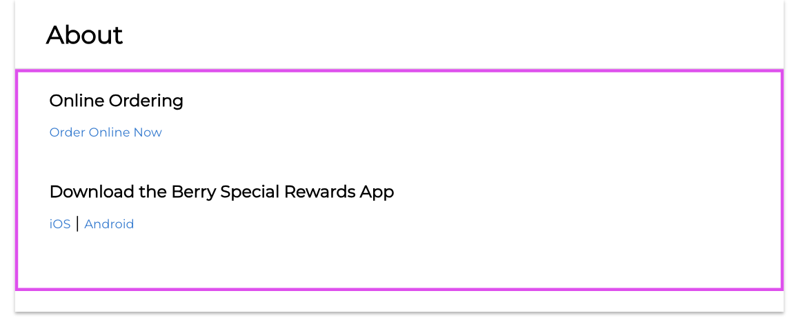 |
