Introduction to Insights
Spendgo Insights provides a quick view of your business's loyalty program and campaign performance. Spendgo compiles this data into various reports that provide useful insights to help inform your next steps and marketing strategy. Use the built in visual reports to help you understand how Members are interacting with your program, export data to dive deeper into the numbers, or integrate Spendgo into a reporting BI tool to combine with your other data.
About Insights
Spendgo collects sales and member data, processes the data to create reports that provide insights into your business.
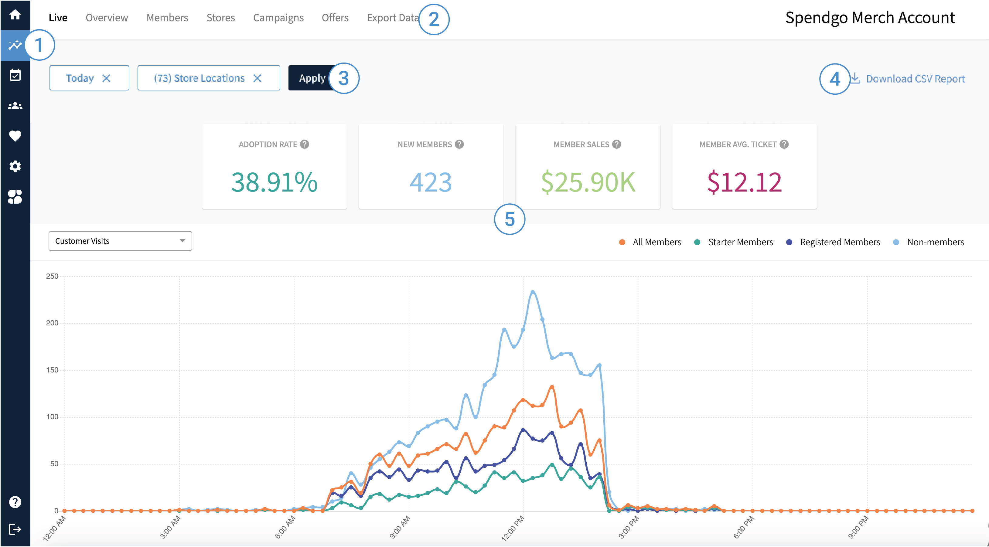
Use the following labeled image to find your way around the Spendgo Dashboard interface.

1. View Insights in your Dashboard
In the left navigation, you can select the Insights icon to view all your Insights.
You must be an Admin user or have Marketing permissions to view Insights. If you do not have permissions, you will not see the Insights icon in your left navigation.
2. Navigate to Different Insights and Reports
The top menu bar provides links to:
Live — Real-time insights into your customer and member activity for a day.
Overview — A snapshot of your loyalty program's performance.
Members — Member trends and top engaged members.
Stores — Store sales and loyalty performances.
Campaigns — Campaign performance metrics.
Rewards/Offers — An side by side look at the performance of your active rewards and offers.
Export Data — A place to generate and download aggregate and/or granular reports.
3. Filter Your Insights
In each Insights section, you are able to use the filters to further refine your results. Filter options are specfic to the page. Learn more about the available filters in the specific Insights sections: Live, Overview, Members, Stores, Campaigns, and Rewards/Offers.
Apply Filters
Review or select your filter criteria.
Note, you may clear a filter by clicking the X within the filter button. This will stop loading your results. You must enter the minimum required filters to apply your filters.Click Apply to load your results.
4. Download CSV Report
On any of the Insights pages, you can download the visible report as a comma-separated values (CSV) file to perform your own reporting or view the raw data for further analysis. Learn more about Download CSV Reports.
5. Explore your Key Performance Indicators (KPIs), Charts, and Tables
Depending on the Insights page you have navigated to, different visualization options:
Key Performance Indicators (KPIs) — Measurable values that demonstrate how effectively your program is achieving its key business objectives.

Example of the KPIs
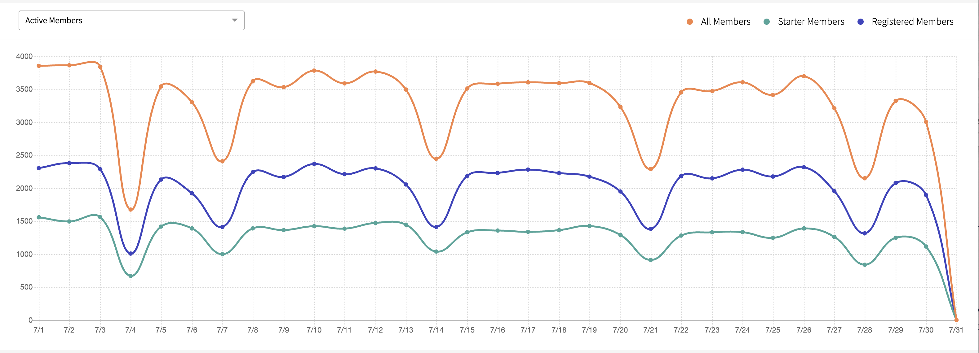
Line Charts — A graphical representations of data that show trends or changes over time.

Example of a Line Chart
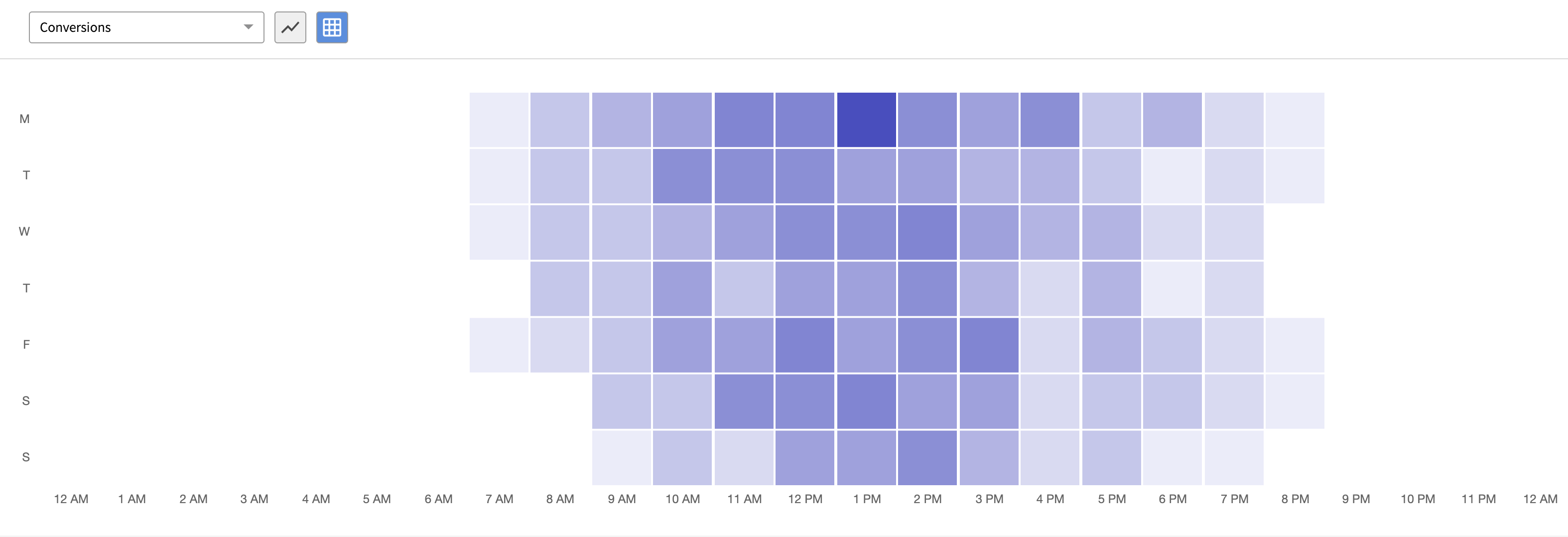
Time-of-Day Heat Chart — A heat chart that displays the data based on the day of the week and time of day, with varying colors indicating different levels of activity.

Example of a Time-of-Day Heat Chart
Data Tables — Displays precise values in a grid format consisting of rows and columns.

Example of a Data Table
